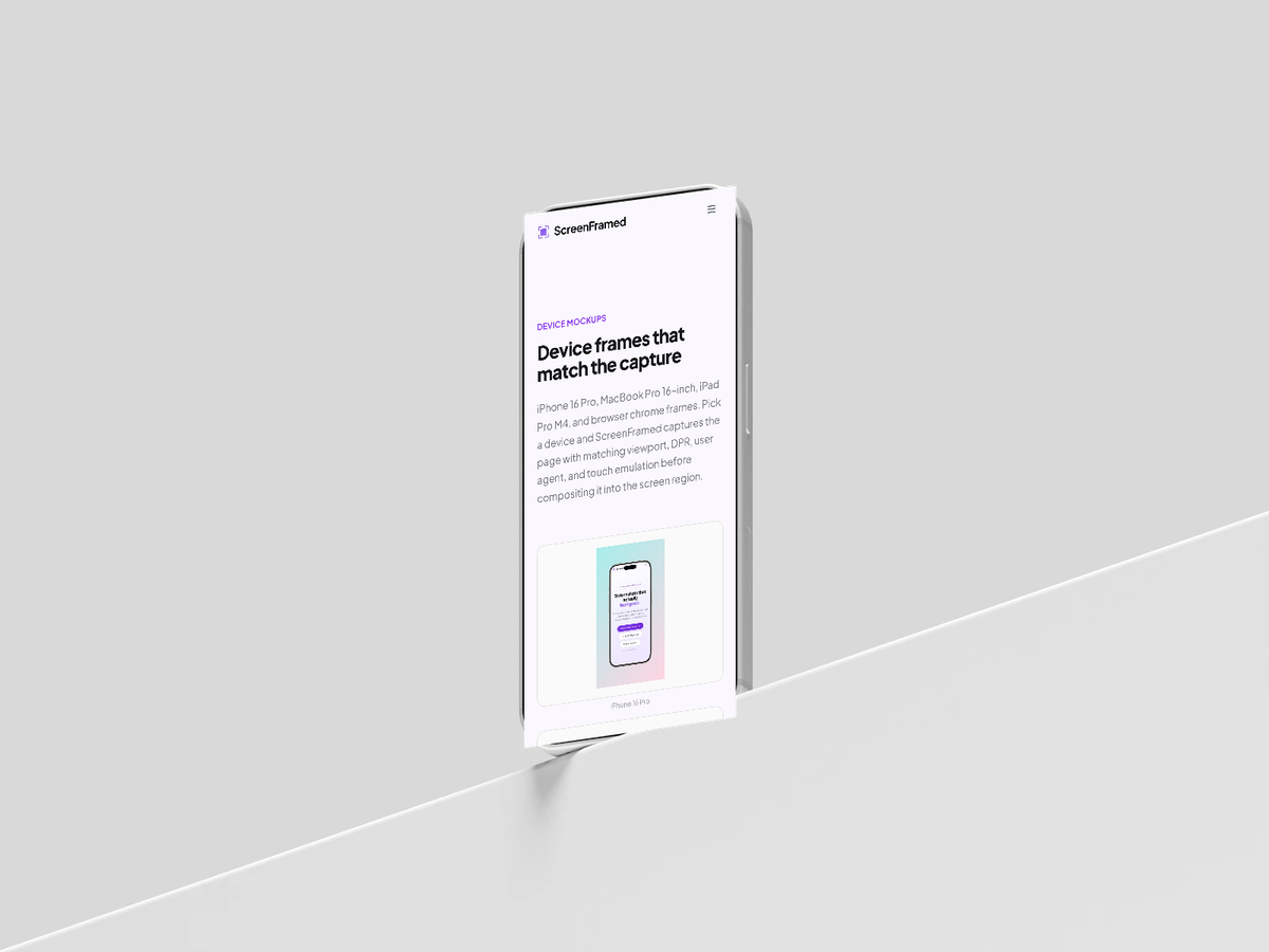
Device Frames
Wrap screenshots in browser, iPhone, iPad, and MacBook frames with matching viewport and emulation behavior.
Device frames control both presentation and browser capture defaults. Physical device frames provide viewport, DPR, user agent, mobile emulation, and touch behavior where appropriate.
Devices
| Value | Result |
|---|---|
browser-macos | Browser chrome with macOS controls. |
browser-windows | Browser chrome with Windows controls. |
iphone-16-pro | iPhone 16 Pro physical frame and mobile browser profile. |
ipad-pro-m4 | iPad Pro M4 physical frame and tablet browser profile. |
macbook-pro-16 | MacBook Pro 16-inch physical frame and desktop viewport. |
json{ "url": "https://example.com", "device": "browser-macos", "background_preset": "midnight", "shadow": "float"}
Device colors
Use device_color for physical frame variants:
json{ "url": "https://example.com/mobile", "device": "iphone-16-pro", "device_color": "natural-titanium", "aspect_ratio": "9:16"}
Available colors depend on the device. Common values include black-titanium, natural-titanium, white-titanium, desert-titanium, silver, and space-black.
Browser chrome
browser-macos and browser-windows are not physical device frames. They render browser chrome around a normal desktop capture and are the best default for SaaS pages, docs pages, landing pages, and dashboards.
json{ "url": "https://example.com/dashboard", "device": "browser-macos", "viewport": { "width": 1440, "height": 900 }}
Frame ratio and scale
Use frame_ratio when you want the screenshot subject to keep a specific shape inside the final canvas:
json{ "url": "https://example.com", "aspect_ratio": "1:1", "frame_ratio": "16:9", "device": "browser-macos"}
Use device_scale or frame_scale to change how large the frame appears inside the output. device_scale applies to device frames; frame_scale can intentionally bleed the mockup past the canvas edges for hero crops.
Perspective presets cannot be combined with physical device frames. Use browser-macos, browser-windows, or a deviceless capture when you need perspective controls.